UI Design Principles
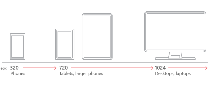
Breakpoints
A breakpoint is the media query values that will mark the transition to a new class of devices. The design will use 2 breakpoints to create 3 types of device; mobile, tablet, and desktop. These breakpoints will be;
-
720px - Transition from phone to tablet
-
1024px - Transition from tablet to desktop
Limited support will be given for devices under 320px width.
Mobile first approach
Designing with the mobile layout first will help separate the essential elements from the secondary ones. Once the mobile design questions are answered, designing for other devices will be easier. The mobile-first approach is also a content-first approach. The heart of the site is content — that’s what the users are there for!

|
Build the mobile wireframe first, then use that as the model for larger breakpoints.
|
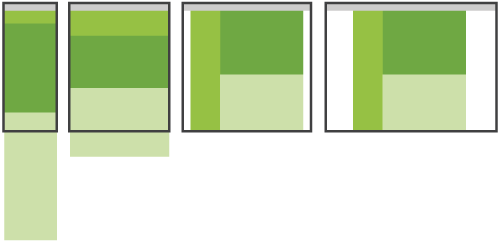
Base layout
The Layout Shifter, the name coined by Luke Wroblewski in his article Multi-Device Layout Patterns, will form the bases of the design.
"This pattern does the most to adapt across different screen sizes. That is, different layouts are used on large, medium, and small screens."
Primary Menu
The application title and primary menu is rendered in the PrimaryMenu section. On mobile devices and tablets the PrimaryMenu will be rendered as a HamburgerMenu in the PageHeader, resulting in a pop-up menu when pressed.
On desktop devices the menu will be rendered on the left.
Page Header
The page header will display the active page name. This will make users aware of the screen/function in view.
The page header will host the HamburgerMenu on the left for mobile and tablet devices.